Scalable Business for Startups

Get the oars in the water and start rowing. Execution is the single biggest factor in achievement so the faster and better your execution.

+1 234 567 8910 info@gmail.com Looking for collaboration for your next creative project?

Blog

How to Design a Food Delivery App People Actually Love

Stop the Finance Dashboard Confusion! Make Yours Simple & Actually Useful

#
Written by

admin

Blog Image

Let’s be honest: a lot of finance dashboards look like someone spilled a bowl of alphabet soup onto a rainbow. Numbers everywhere! Charts you need a PhD to understand! It’s overwhelming, confusing, and honestly... not very helpful.

But it doesn’t have to be that way! A good finance dashboard should be like your car’s dashboard. It shows you the key things you need to know, quickly and clearly, so you can make smart decisions without getting lost. Here’s how to make yours simple and user-friendly:

1. Know Your Audience (Seriously, Who’s Looking?)
  • Ask Yourself: Who will use this? The CEO? The sales team? You managing your small business?
  • Why it Matters: The CEO might need high-level profit numbers. The sales team cares about leads and deals closed. Show only what matters to the people looking. Don’t overload everyone with everything.
2. Less is WAY More (Focus!)
  • Pick the BIG 3-5: What are the absolute most important numbers for your audience? Profit? Cash in the bank? Sales this month? Costs? Pick just a few key things (KPIs - Key Performance Indicators)..
  • Cut the Clutter: Get rid of every chart, graph, and number that isn’t critical. If it doesn’t help someone make a decision right now, it’s probably noise.

3. Speak Visually (Use Pictures Wisely)

Choose the Right Chart:


  • Trends over time? Use a simple line chart.
  • Comparing a few things? A bar chart works great.
  • Showing parts of a whole? A pie chart is okay (but keep it simple!).
  • Keep Charts Clean: Avoid 3D effects, fancy backgrounds, or too many colors. Label axes clearly. Add a short, simple title that says what the chart shows.
4. Keep Words Simple & Clear
  • Ditch the Jargon: Say "Money Coming In" instead of "Revenue Influx." Say "Spending" instead of "Operating Expenditures."
  • Use Clear Labels: Every number and chart needs a label anyone can understand. "Total Sales - June" is better than just "Sales (06)."
  • Short Headlines: Tell people what they're seeing and why it matters in one short sentence.

Blog Image
Blog Image
5. Make it Easy on the Eyes (Design Basics)l
  • Color with Care: Use color only to highlight important things (like if a number is good, bad, or needs attention). Stick to 2-3 main colors max. Avoid neon!
  • White Space is Your Friend: Don't cram everything together. Give numbers and charts room to breathe. It makes them easier to read.
  • Big, Clear Numbers: Use large fonts for the most important figures.
6. Tell a Tiny Story (Context!)
  • Compare: Show this month vs. last month, or this year vs. last year. Is that $10,000 profit good? It’s hard to tell without knowing it was only $5,000 last month!
  • Simple Status: Use easy symbols like a green up arrow (good), red down arrow (needs attention), or yellow dash (on track).
7. Test It! (The "Grandma Test")

Show your dashboard to someone not familiar with your finances (a colleague from another department, a friend). Can they understand the main points in 10 seconds? If they look confused or ask "What does this mean?", go back and simplify!


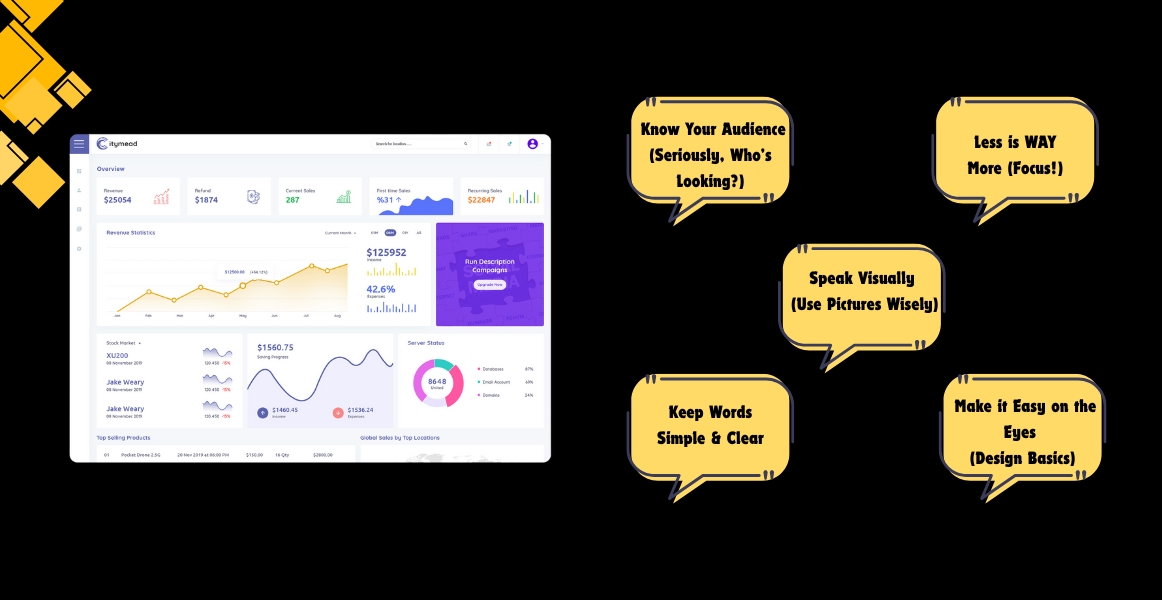
Simple Dashboard Cheat Sheet


  • Do This: Show only 3-5 key numbers.
  • Not This: Display 20 different metrics
  • Do This: Use simple bar/line charts.
  • Not This: Use complex 3D pie charts with explosions
  • Do This: Label clearly: "Cash Balance"
  • Not This: Use acronyms: "CBAL"
  • Do This: Use color sparingly for focus
  • Not This: Rainbow explosion of colors
  • Do This: Add context: "vs. Target +5%"
  • Not This: Just show the raw number: "$10,500"
  • Do This: Lots of white space,
  • Not This: Crammed, cluttered layout
Why Bother Making it Simple?
  • Faster Decisions: People see what matters instantly, no decoding needed.
  • Less Stress: No more staring at a confusing screen feeling lost.
  • Better Actions: Clear data leads to smarter choices for your business or team.
  • Everyone's Included: People without finance degrees can understand and contribute.

Remember: A great finance dashboard isn't about showing off all the data you have. It's about showing the right people the few bits of data they need in the clearest way possible. Keep it focused, keep it visual, keep it simple, and watch how much more useful (and actually used!) your dashboards become!